

HISTOGRAMS AND DISPERSION ANALYSIS
EXCEL ANALYZERS
Learn, download the Excel templates, practice and check your skills
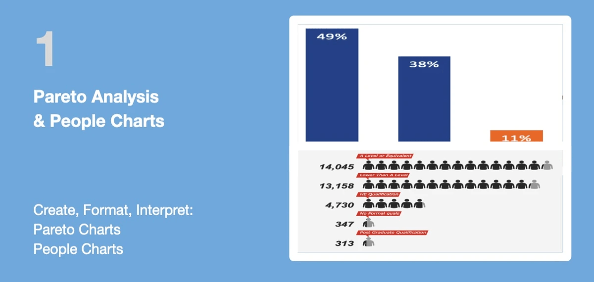
1 Pareto Analysis & People Charts
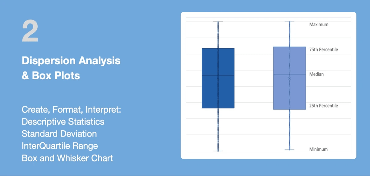
2 Dispersion Analysis & Box Plots

3 Histograms and Bell Curves
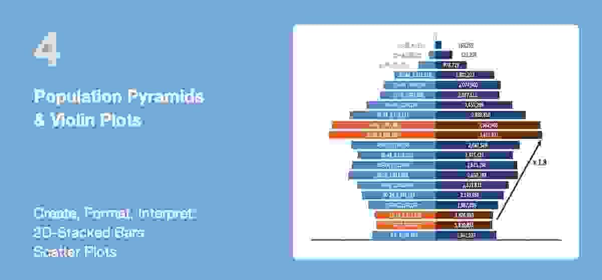
4 Population Pyramids & Violin Plots

1 Pareto Analysis & People Charts
1. Learn
PERFORMANCE OBJECTIVES
At the end of this module, you will know how to:
- Conduct a Pareto analysis;
- Visualize data as Pareto Chart or People Chart;
- Interpret the analysis outcome.
WHAT IS A PARETO ANALYSIS?
Pareto Analysis is an analysis technique in decision-making used for the selection of a limited number of parameters that are most significant.
It uses the Pareto Principle, also known as the 80/20 rule: its idea is that 20% of the efforts can generate 80% of the benefit of doing the entire job. This analysis is useful where many possible parameters are competing for attention. For instance, it can be used to estimate the benefits delivered by each action, then to select a number of the most effective actions that deliver the best possible benefit.
If your data is about people counts, you can visualize the results as a People Chart.
Note: The principles behind the Pareto analysis originated in 1897. An Italian economist, Vilfredo Pareto, created a 80-20 formula representing the uneven distribution of wealth. Pareto’s first work, Cours d’économie politique (1896–97), included his famous but much-criticized law of income distribution, a complicated mathematical formulation in which Pareto attempted to prove that the distribution of incomes and wealth in society is not random and that a consistent pattern appears throughout history, in all parts of the world and in all societies.
Sources: britannica.com, wikipedia.org, kaggle.com
SKILL PRACTICE
1. Download the attached XLS file:
- The first tab contains Sample Data;
- The second tab Pareto Analysis explains the steps to conduct a Pareto analysis together with a sample analysis;
Please practice your skills in the third tab Skill Practice: first, an easy practice then more difficult.
2. Report the outcome of your practice in the Skill Assessment quiz.
2. Download & Practice
3. Check Your Skills
Refresh the page to retake the test or explore additional member resources
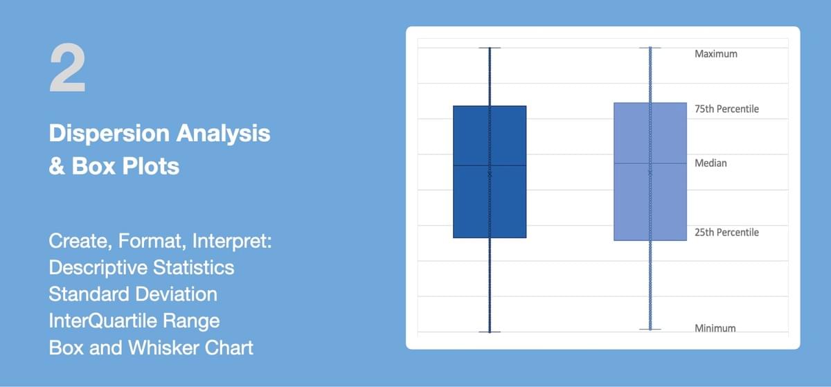
2 Dispersion Analysis & Box Plots
1. Learn
PERFORMANCE OBJECTIVES
At the end of this module, you will know how to:
- Use Excel's Descriptive Statistics including Range and Standard Deviation;
- Calculate and use the InterQuartile Range (IQR);
- Create and interpret a Box and Whisker Chart.
This module includes opportunities to practice and assess your skills to conduct this type of analysis.
WHAT IS A DISPERSION ANALYSIS?
Measures of central tendency like mean (average) or median are not sufficient to describe data, Two data sets can have the same mean but they can be entirely different. Thus to describe data, one needs to know the extent of variability or dispersion. This is given by the following three measures of dispersion:
1. Range, the difference between the largest and the smallest observation in the data. The prime advantage of the range of dispersion is that it is easy to calculate. On the other hand, it is very sensitive to outliers and does not use all the observations in a data set.
2. Interquartile Range (IQR), the difference between the 25th and 75th percentile (also called the first and third quartile). Hence the interquartile range describes the middle 50% of observations.
- If the interquartile range is small it means that the middle 50% of observations are concentrated around the median.
- If the interquartile range is large it means that the middle 50% of observations are spaced wide apart.
- The important advantage of interquartile range is that it can be used as a measure of variability that it is not affected by extreme values.
- For skewed numerical data (not well distributed), it is best to use median and interquartile range.
3. Standard Deviation (SD) , the spread of data around the mean
SD is the square root of sum of squared deviation from the mean divided by the number of observations.
- A low standard deviation indicates that the values tend to be close to the mean of the dataset
- A high standard deviation indicates that the values are spread out over a wider range.
- SD is best used as a measure of dispersion when mean is used as measure of central tendency and the data have a symmetric or normal distribution.
Note: Statistical tools were first developed in the early 19th century as the study of populations, economies, and moral actions. In France,
mathematicians such as Laplace used probability to surmise the accuracy of population figures determined from samples. In the 19th century such methods of estimation fell into disuse, mainly because they were replaced by regular, systematic censuses. The census of the United States, required by the U.S. Constitution and conducted every 10 years beginning in 1790, was among the earliest.SKILL PRACTICE
1. Download the attached XLS file:
- The first tab contains Sample Data;
- The second tab Dispersion Analysis explains the steps to conduct a Dispersion Analysis together with a sample analysis;
- Please practice your skills in the third tab Skill Practice: first, an easy practice then more difficult.
2. Report the outcome of your practice in the Skill Assessment quiz.
2. Download & Practice
3. Check Your Skills
Refresh the page to retake the test or explore additional member resources
3 Histograms & Bell Curves
1. Learn
PERFORMANCE OBJECTIVES
At the end of this module, you will know how to:
- Create, visualize and interpret histogram;
- Create a normal distribution chart.
This module includes opportunities to practice and assess your skills to conduct this type of analysis.
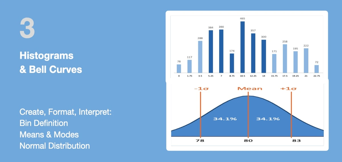
WHAT IS AN HISTOGRAM?
A histogram is chart plotting the distribution of numerical data with:
- The data ranges on the X-axis;
- The count of objects on the Y-axis.
There are multiple types of patterns for the distribution of data:
- Normal Distribution: a common pattern also called the bell-shaped curve or "normal distribution." In a normal or "typical" distribution, points are as likely to occur on one side of the average as on the other. Note that other distributions look similar to the normal distribution;
- Skewed Distribution: an asymmetrical distribution when the peak is off center toward the limit and a tail stretches away from it;
- Double-Peaked or Bimodal: this looks like the back of a two-humped camel;
- Plateau or Multimodal Distribution: the plateau might be called a “multimodal distribution.” Several processes with normal distributions are combined. Because there are many peaks close together, the top of the distribution resembles a plateau.
Note: Histogram was first introduced and coined by Karl Pearson at the end of the 19th century. Pearson was a leading UK scientist who established the foundations to contemporary mathematical statistics.
SKILL PRACTICE
1. Download the attached Excel file:
- The first tab contains Sample Data;
- The second tab Histogram and Bell Curve explains the steps to create and interpret a histogram;
- Please practice your skills in the third tab Skill Practice: first, an easy practice then more difficult..
2. Report the outcome of your practice in the Skill Assessment quiz.
2. Download & Practice
3. Check Your Skills
Refresh the page to retake the test or explore additional member resources
4 Population Pyramids & Violin Plots
1. Learn
PERFORMANCE OBJECTIVES
At the end of this module, you will know how to:
- Create and interpret Population Pyramids;
- Create and interpret Violin Plots.
This module includes opportunities to practice and assess your skills to conduct this type of analysis.
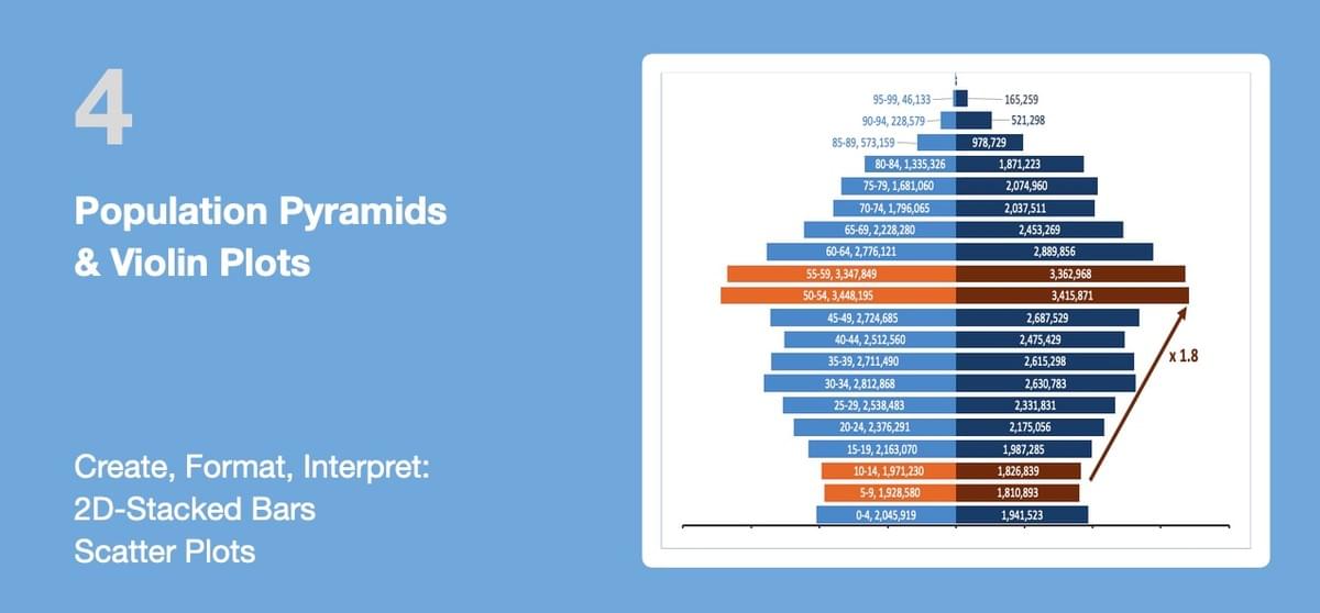
WHAT IS A POPULATION PYRAMIDS AND VIOLIN PLOTS?
This module describes two ways to visualize the distribution of two datasets around the same vertical axis:
1. A Population Pyramid, also called Age-Gender Pyramid, represents the distribution of various age groups in the shape of a pyramid. This can be used as the graphical illustration of the population of a country, a region or an organization:
- Men are typically represented on the left, women on the right;
- Variances in the shape of the pyramid highlight gaps in specific group;
- The structure of the pyramid can also help Human Resource department identify and anticipate so-called "Retirement Bow Wave".
2. A Violin Plot is used to visualise the distribution of the data and its probability density. It is a similar to the box-plot chart described in the previous module:
- While a box plot only shows summary statistics such as median and interquartile ranges (IQR), the violin plot shows the full distribution of the data;
- The difference is particularly useful when the data distribution is multimodal (more than one peak). In this case a violin plot shows the presence of different peaks, their position and relative amplitude;
- Simple Violin Plots can be used to illustrate the difference in salary levels between two groups of employees or between two departments
Note: The first population pyramid was published in 1874 in the United States. At the time, a population with high birth and death rates is wide at the bottom (young ages) and narrow at the top (old ages): this is the shape of a pyramid.
SKILL PRACTICE
1. Download the attached Excel file:
- The first tab contains Sample Data;
- The second tab Pyramid and Violin Charts explains the steps to create pyramid and violin plots;
- Please practice your skills in the third tab Skill Practice: first, an easy practice then more difficult..
2. Report the outcome of your practice in the Skill Assessment quiz.
2. Download & Practice
3. Check Your Skills
Refresh the page to retake the test or explore additional member resources


